WESTVIEW DENTAL
Redesign a dental website to increase user engagement and site conversions
Role: Research • UX/UI Design
Tools: XD, Photoshop, Premiere Pro, & DevTools
OVERVIEW
OVERVIEW
OVERVIEW
OVERVIEW
Attract new dental patients by redesigning a website to be accessible, responsive, and polished
Attract new dental patients by redesigning a website to be accessible, responsive, and polished
Problem Statement
--------------------------------------------------
Since 2020, Westview Dental has experienced a drop in patients. Looking to the website for help, the owner found it outdated and error-ridden, no longer reflecting the high caliber service his dentistry provides.
Problem Statement
--------------------------------------------------
Since 2020, Westview Dental has experienced a drop in patients. Looking to the website for help, the owner found it outdated and error-ridden, no longer reflecting the high caliber service his dentistry provides.
Problem Statement
--------------------------------------------------
Since 2020, Westview Dental has experienced a drop in patients. Looking to the website for help, the owner found it outdated and error-ridden, no longer reflecting the high caliber service his dentistry provides.
Problem Statement
--------------------------------------------------
Since 2020, Westview Dental has experienced a drop in patients. Looking to the website for help, the owner found it outdated and error-ridden, no longer reflecting the high caliber service his dentistry provides.
Hypothesis
--------------------------------------------------
Addressing functionality, accessibility, and readability, user confidence will increase and result in a higher conversion rate.
Hypothesis
--------------------------------------------------
Addressing functionality, accessibility, and readability, user confidence will increase and result in a higher conversion rate.
Solution
--------------------------------------------------
Create a website that is accessible and relatable, with a strong call-to-action encouraging users to request an appointment.
Solution
--------------------------------------------------
Create a website that is accessible and relatable, with a strong call-to-action encouraging users to request an appointment.
Impact
--------------------------------------------------
568% improvement
Impact
--------------------------------------------------
400% increase
in baseline color contrast scores (per WCAG), 55% reduction in responsiveness errors, and, based on ten interviews, user engagement increased 400% and site conversions increased 100%.
in target audience user engagement and a 100% increase in target audience site conversions, based on ten interviews.
RESEARCH & STRATEGY
RESEARCH & STRATEGY
RESEARCH & STRATEGY
RESEARCH & STRATEGY
RESEARCH & STRATEGY
Understand and resolve the disconnect between the needs of prospective patients and what is currently available
Understand and resolve the disconnect between the needs of prospective patients and what is currently available
Understand and resolve the disconnect between the needs of prospective patients and what is currently available
Understand and resolve the disconnect between the needs of prospective patients and what is currently available
Understand and resolve the disconnect between the needs of prospective patients and what is currently available
Baseline
----------------------------------------
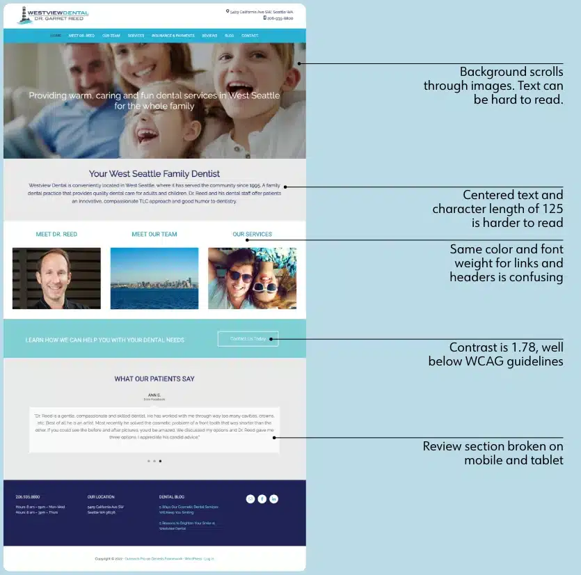
My first step? Identify what worked and what didn't. I created a site map to determine how many pages were available (responsiveness issues are marked in blue), and used an heuristics evalution to identify issues on both desktop and mobile platforms (ex. broken links and non-responsive elements).
Baseline
----------------------------------------
My first step? Identify what worked and what didn't. I created a site map to determine how many pages were available, and used an heuristics evalution to identify issues on both desktop and mobile platforms (ex. broken links and non-responsive elements).
My first step? Identify what worked and what didn't. I created a site map to determine how many pages were live, and used an heuristics evalution to identify issues on both desktop and mobile platforms (ex. broken links and non-responsive elements).
Home page with some of the errors noted from the heuristic evaluation
Home page with some of the errors noted from the heuristic evaluation
Home page with some of the errors noted from the heuristic evaluation
Home page with some of the errors noted from the heuristic evaluation
Home page with some of the errors noted from the heuristic evaluation
Prospective Patient Needs
--------------------------------------------------
Equipped with an objective understanding of the site's errors, I took the problem to the people, interviewing 10 individuals aged 18-68. Questions included:
- How do you choose a dentist?
- What information is important when choosing a new dentist?
...as well as thoughts regarding the strengths and pain points of the current site.
Prospective Patient Needs
--------------------------------------------------
Equipped with an objective understanding of the site's errors, I took the problem to the people, interviewing 10 individuals aged 18-68. Questions included:
- How do you choose a dentist?
- What information do you look for when you choose?
...as well as thoughts regarding the strengths and pain points of the current site.
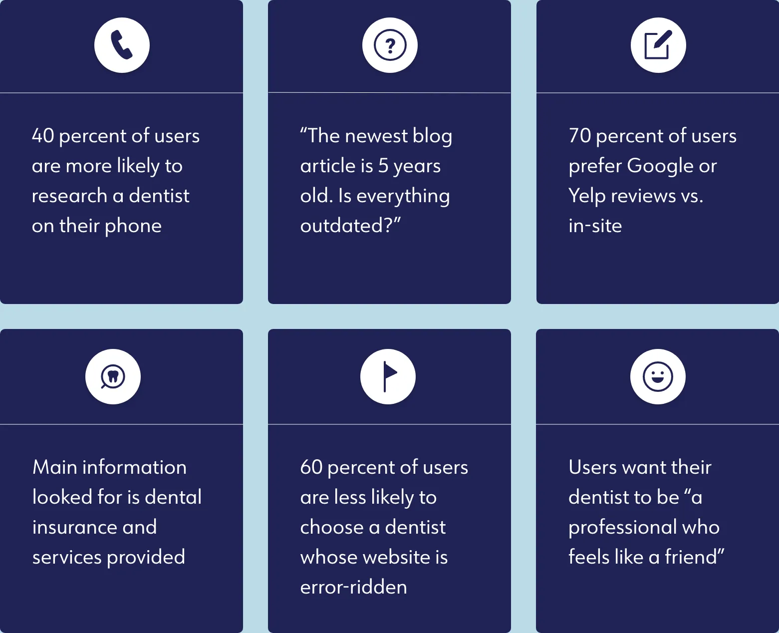
Key highlights of the user interviews
Key highlights of the user interviews
Key highlights of the user interviews
Key highlights of the user interviews
Key highlights of the user interviews
Align With Business Needs
--------------------------------------------------
With the bulk of the research complete, I checked in with the owner to discuss "next steps".
Together, we came up with four design guidelines:
Align With Business Needs
--------------------------------------------------
With the bulk of the research complete, I checked in with the owner to discuss "next steps".
Together, we came up with four design guidelines.
Align With Business Needs
--------------------------------------------------
With the bulk of the research complete, I checked in with the owner to discuss "next steps".
Together, we came up with four design guidelines.
Align With Business Needs
--------------------------------------------------
With the bulk of the research complete, I checked in with the owner to discuss "next steps".
Together, we came up with four design guidelines.
Align With Business Needs
--------------------------------------------------
With the bulk of the research complete, I checked in with the owner to discuss "next steps".
Together, we came up with four design guidelines.
DESIGN
DESIGN
DESIGN
DESIGN
Redesign the website to be accessible and familiar for users, and easily maintainable for stakeholders.
Redesign the website to be accessible and familiar for users, and easily maintainable for stakeholders.
Redesign the website to be accessible and familiar for users, and easily maintainable for stakeholders.
Redesign the website to be accessible and familiar for users, and easily maintainable for stakeholders.
Step 1: Address
----------------------------------------
Building off of the site map and heuristic evaluation information, I divided errors into three categories:
- Non-responsive
- Broken, but fixable
- Removable
The first two would remain in the design and be addressed during the mobile design and development. The third would, well, be removed.
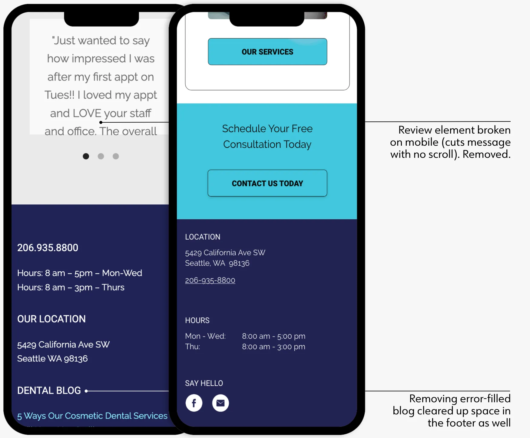
In-site reviews were distrusted by users and the blog negatively impacted viewer confidence
In-site reviews were distrusted by users and the blog negatively impacted viewer confidence
In-site reviews were distrusted by users and the blog negatively impacted viewer confidence
In-site reviews were distrusted by users and the blog negatively impacted viewer confidence
Step 2: Familiarity
----------------------------------------
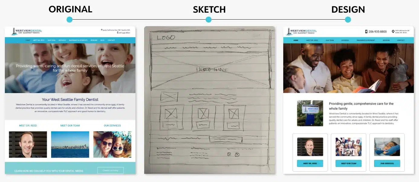
I made sketches to ensure I was aligned with the original design, then pared down the website's UI kit to create a more consistent visual hierarchy.
Step 2: Familiarity
----------------------------------------
I made sketches to ensure I was aligned with the original design, then pared down the website's UI kit to create a more consistent visual hierarchy.
Step 2: Familiarity
----------------------------------------
I made sketches to ensure I was aligned with the original design, then pared down the website's UI kit to create a more consistent visual hierarchy.
Step 2: Familiarity
----------------------------------------
I made sketches to ensure I was aligned with the original design, then pared down the website's UI kit to create a more consistent visual hierarchy.
Step 3: DEI & A
----------------------------------------
I focused on three areas to boost diversity, equity, inclusivity, and accessibility:
- WCAG AAA contrast guidelines and larger text
- Emphasize buttons over linkable text
- Include greater image diversity
Step 3: Accessibility
----------------------------------------
I focused on three areas to boost accessibility, diversity and inclusivity:
- WCAG AAA contrast guidelines and larger text
- Emphasize buttons over linkable text
- Include greater image diversity
Step 3: Accessibility
----------------------------------------
I focused on three areas to boost accessibility, diversity and inclusivity:
- WCAG AAA contrast guidelines and larger text
- Emphasize buttons over linkable text
- Include greater image diversity
Step 3: D, E, I, & A
----------------------------------------
I focused on three areas to boost diversity, equity, inclusivity, and accessibility:
- WCAG AAA contrast guidelines and larger text
- Emphasize buttons over linkable text
- Include greater image diversity
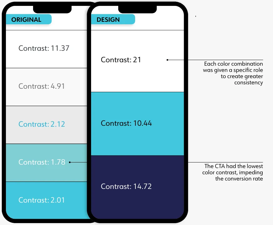
The design's minimum color contrast of 10.44 is well above the WCAG 7.0 baseline
The iterated design achieves a minimum contrast of 10.44, well above the 7.0 baseline.
The iterated design achieves a minimum contrast of 10.44, well above the 7.0 baseline.
The iterated design achieves a minimum contrast of 10.44, well above the 7.0 baseline.
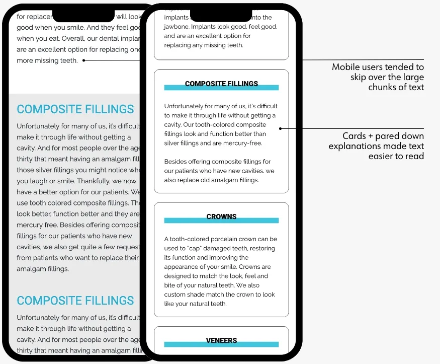
Cards complement the shorter text lines, boosting readability
Cards complement the shorter text lines, boosting readability
Cards complement the shorter text lines, boosting readability
Cards complement the shorter text lines, boosting readability
Step 4: Call-To-Action
----------------------------------------
A CTA can have a sizable impact on a site's click and conversion rate. To create a stronger message and encourage more users to click and convert, the original CTA ("learn how we can help with your dental needs") was changed to:
"Schedule your free consultation today"
The new CTA was received well by testers, who used words such as "strong" and "motivating" to describe it.
Step 4: Call-To-Action
----------------------------------------
"Learn how we can help with your dental needs"
The original CTA seen above has a low site conversion rate. To create a stronger message and encourage more users to reach out, it was changed to:
"Schedule your free consultation today"
Step 4: Call-To-Action
----------------------------------------
"Learn how we can help with your dental needs"
The original CTA seen above has a low site conversion rate. To create a stronger message and encourage more users to reach out, it was changed to:
"Schedule your free consultation today"
Step 4: Call-To-Action
----------------------------------------
"Learn how we can help with your dental needs"
The original CTA seen above has a low site conversion rate. To create a stronger message and encourage more users to reach out, it was changed to:
"Schedule your free consultation today"
REFINE
REFINE
REFINE
REFINE
REFINE
Further improve the mobile experience to maximize responsiveness and the overall aesthetic.
Further improve the mobile experience to maximize responsiveness and the overall aesthetic.
Further improve the mobile experience to maximize responsiveness and the overall aesthetic.
Further improve the mobile experience to maximize responsiveness and the overall aesthetic.
Mobile
----------------------------------------
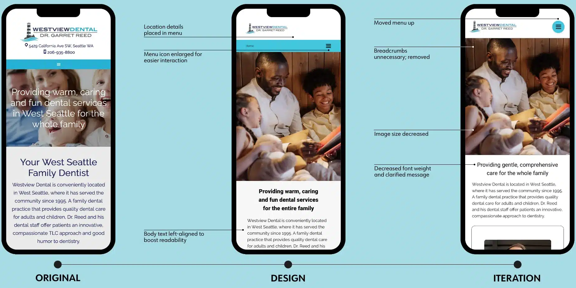
Time constraints on the project made user testing difficult, though a few quick tests resulted in some key changes to the mobile design.
Mobile
----------------------------------------
Time constraints on the project made user testing difficult, though a few quick tests resulted in some key changes to the mobile design.
Mobile
----------------------------------------
Time constraints on the project made user testing difficult, though a few quick tests resulted in some key changes to the mobile design.
Mobile
----------------------------------------
Time constraints on the project made user testing difficult, though a few quick tests resulted in some key changes to the mobile design.
PROTOTYPE
PROTOTYPE
PROTOTYPE
PROTOTYPE
PROTOTYPE
Desktop
----------------------------------------
Desktop
----------------------------------------
Desktop
----------------------------------------
Desktop
----------------------------------------
Desktop
----------------------------------------
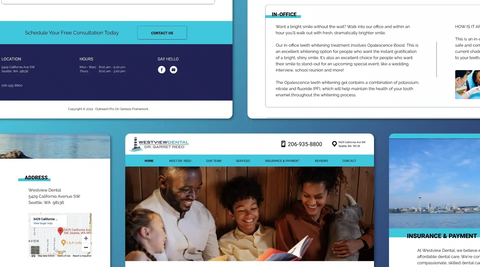
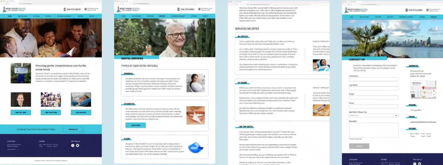
Screens from the desktop prototype
Screens from the desktop prototype
Screens from the desktop prototype
Screens from the desktop prototype
Screens from the desktop prototype
Mobile
----------------------------------------
The main problem with the website was its lack of mobile responsiveness. Creating a mobile prototype demonstrated the new, improved design.
Mobile
----------------------------------------
The main problem with the website was its lack of mobile responsiveness. Creating a mobile prototype demonstrates the new, improved design.
Mobile
----------------------------------------
The main problem with the website was its lack of mobile responsiveness. Creating a mobile prototype demonstrates the new, improved design.
Mobile
----------------------------------------
The main problem with the website was its lack of mobile responsiveness. Creating a mobile prototype demonstrates the new, improved design.
Mobile
----------------------------------------
The main problem with the website was its lack of mobile responsiveness. Creating a mobile prototype demonstrates the new, improved design.
FINAL THOUGHTS
FINAL THOUGHTS
FINAL THOUGHTS
FINAL THOUGHTS
FINAL THOUGHTS
Blog
----------------------------------------
The blog was error-ridden and outdated, but the content was good. While it was removed from the visible design, articles can be written whenever, easing pressure to keep the blog section constantly updated. This way, individual articles can be referenced and linked to as needed in social media posts.
Online Scheduling
----------------------------------------
During initial interviews, users preferred scheduling appointments online (vs. calling or emailing) given the limited office hours and delayed response rate typically seen with dental offices. Though the monthly cost for those programs (averaging $150 - 300) is too high for the stakeholder, this would be a valuable future addition, further boosting the conversion rate.
Call-To-Action
----------------------------------------
While I know the CTA is not the sole reason for higher conversion rates, given more time, it would be worth testing different placements, wording, and designs of the CTA to see which combination generates the most clicks and conversions.
Online Scheduling
----------------------------------------
During initial interviews, users preferred scheduling appointments online (vs. calling or emailing) given the limited office hours and delayed response rate typically seen with dental offices. Though the monthly cost for those programs (averaging $150 - 300) is too high for the stakeholder, this would be a valuable future addition, further boosting the conversion rate.
Results
----------------------------------------
Though the stakeholder has not yet rolled out the new design, I am confident these changes will create the positive growth the stakeholder is looking for.
- Increasing baseline color contrast scores (per WCAG) by 568%
- Reducing responsiveness errors by 55%
- A 400% increase in user confidence and a 100% increase in the conversion rate, based on a survey of ten people (fun fact: one booked an appointment at Westview after seeing the updated website design)
Results
----------------------------------------
Though the website has not been updated yet, I am confident these changes will create the positive growth the stakeholder is looking for. Based on user feedback, this growth includes:
- 400% increase in user confidence in the products and services offered
- Doubling the conversion rate (fun fact: of the users interviewed, one booked an appointment at Westview after seeing the updated website)
All in all, I say this is another site officially...
