THE NAKED GROCER
THE NAKED GROCER
THE NAKED GROCER
THE NAKED GROCER
Create a responsive website to boost exposure and build confidence in a new grocery store
Create a responsive website to boost exposure and build confidence in a new grocery store
Create a responsive website to boost exposure and build confidence in a new grocery store
Create a responsive website to boost exposure and build confidence in a new grocery store
Project: End-to-End Website Design
Role: Research & Product Design
Tools: XD, Photoshop, Optimal Workshop, Premiere Pro, Word
OVERVIEW
OVERVIEW
OVERVIEW
OVERVIEW
PROBLEM
--------------------------------------------------
The Naked Grocer is a new grocery store in Seattle centered around zero waste - a familiar concept with an unfamiliar name - so exposure and confidence are low.
How can we offer a seamless browsing experience that boosts exposure and builds consumer confidence in a new concept as quickly as possible?
SOLUTION
--------------------------------------------------
Explain the process with informative yet relatable pages and utilize a consistent design across all platforms to boost brand recognition and social media exposure.
SOLUTION
--------------------------------------------------
Explain the process with informative yet relatable pages and utilize a consistent design across all platforms to boost brand recognition and social media exposure.
IMPACT
--------------------------------------------------
300 new site visits in the first month,
IMPACT
--------------------------------------------------
300 new site visits in the first month,
IMPACT
--------------------------------------------------
300 new site visits in the first month,
IMPACT
--------------------------------------------------
300 new site visits in the first month,
IMPACT
--------------------------------------------------
300 new site visits in the first month,
as well as a 10% site conversion rate, plus a 25% decrease in user-reported errors.
as well as a 10% site conversion rate, plus a 25% decrease in user-reported errors.
as well as a 10% site conversion rate, plus a 25% decrease in user-reported errors.
as well as a 10% site conversion rate, plus a 25% decrease in user-reported errors.
EMPATHIZE
EMPATHIZE
EMPATHIZE
EMPATHIZE
RESEARCH OBJECTIVE
--------------------------------------------------
Determine why people use a grocery store's website and establish what people know about zero waste (if anything).
RESEARCH
-----------------------------------------------
Determine why people use a grocery store's website and establish what people know about zero waste (if anything).
USER INTERVIEWS
--------------------------------------------------
Interviewing five target customers of varying ages and backgrounds revealed patterns in user needs, preferences, and behaviors, which were essential for creating an effective and user-friendly website.
USER INTERVIEWS
--------------------------------------------------
Interviewing five target customers of varying ages and backgrounds revealed patterns in user needs, preferences, and behaviors, which were essential for creating an effective and user-friendly website.
USER INTERVIEWS
-----------------------------------------------
Key takeaways:
- Users visit grocery sites primarily to make online purchases (to have delivered)
- 100% of users disliked the amount of packaging waste created
- Only 40% of users knew about zero waste
COMPETITIVE ANALYSIS
--------------------------------------------------
While gathering insights and identifying opportunities to help set Naked Grocer apart from other stores, I focused on nine competitors: six primary and three secondary.
COMPETITIVE ANALYSIS
--------------------------------------------------
While gathering insights and identifying opportunities to help set Naked Grocer apart from other stores, I focused on nine competitors: six primary and three secondary.
COMPETITIVE ANALYSIS
--------------------------------------------------
While gathering insights and identifying opportunities to help set Naked Grocer apart from other stores, I focused on nine competitors: six primary and three secondary.
COMPETITIVE ANALYSIS
-----------------------------------------------
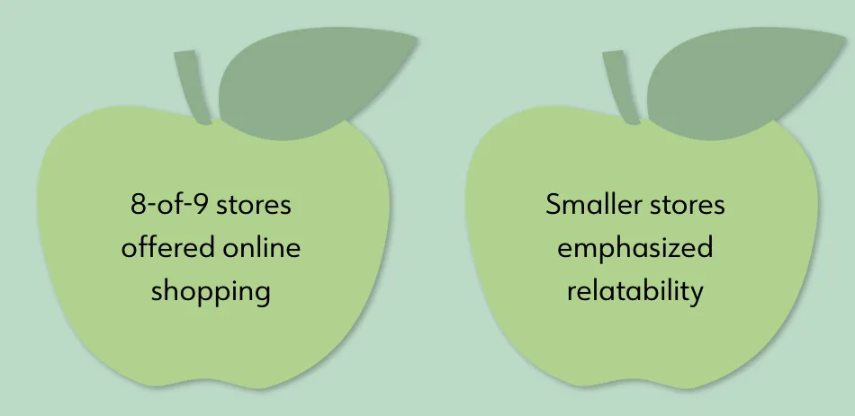
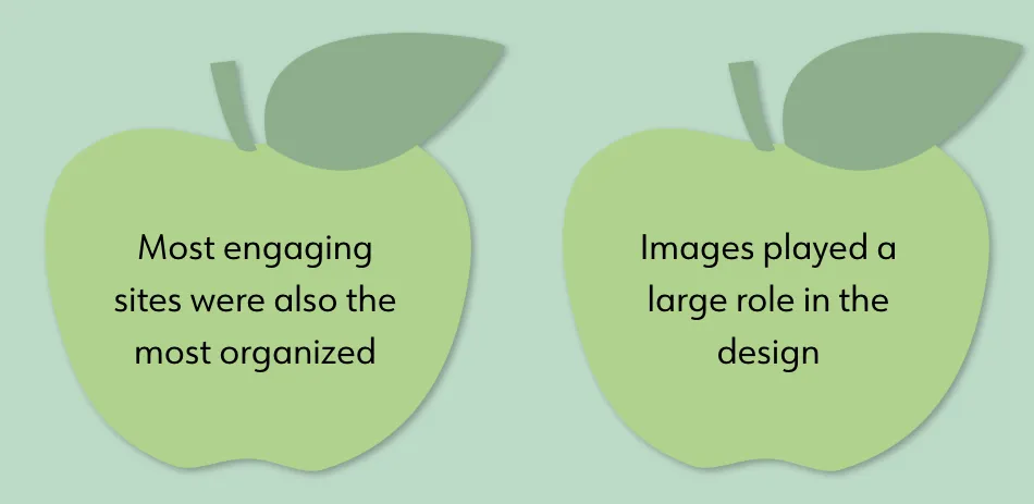
Of the nine stores:
- All but one store offered online shopping
- Smaller stores focused on the personal connection - "how we came to be", ethos, etc. - while larger stores focused on online shopping
DEFINE
DEFINE
DEFINE
DEFINE
PAIN POINTS
--------------------------------------------------
User interviews revealed two main pain points:
- Budget-conscious shoppers care less about minimizing waste if it costs more
- Users aren't as likely to visit a grocery site that doesn't have an online shopping experience
PAIN POINTS
--------------------------------------------------
User interviews revealed two main pain points:
- Budget-conscious shoppers care less about minimizing waste if it costs more
- Users aren't as likely to visit a grocery site that doesn't have an online shopping experience
PROBLEM STATEMENTS
--------------------------------------------------
Based on conversations with the owner, and the information acquired during the research phase, two key areas needed to be addressed:
- Knowing the owner isn't ready to offer online shopping yet, how might we create a user experience that encourages site traffic, but also makes it easy to add an online store in the future?
- How might we supply information about zero waste in a relatable way that helps overcome budget concerns?
PERSONA
--------------------------------------------------
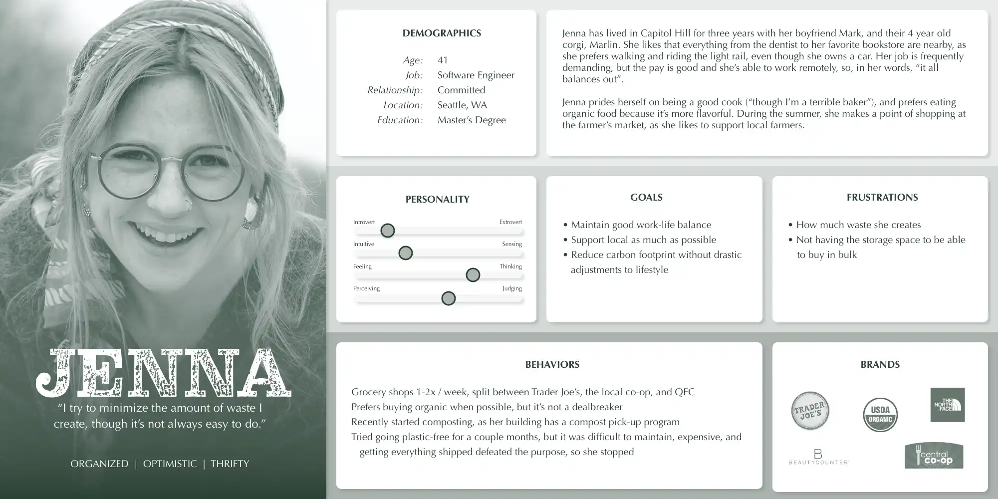
Based on the data and research compiled, a persona was created to embody the characteristics, needs, and goals of Naked Grocer's target audience. The persona, Jenna, was an invaluable resource and guided the rest of the design process.
PERSONA
--------------------------------------------------
Based on the data and research compiled, a persona was created to embody the characteristics, needs, and goals of Naked Grocer's target audience. The persona, Jenna, was an invaluable resource and guided the rest of the design process.
IDEATE
IDEATE
IDEATE
IDEATE
DEVELOPMENT TIMELINE
--------------------------------------------------
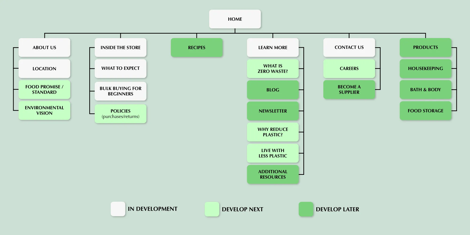
Before diving into the design itself, a site map was created to determine the pages and features needed for the minimum viable product (MVP). Knowing the timeline of each page helps the design stay on schedule, I incorporated a product roadmap into the site map as well.
PAGES TO DESIGN
--------------------------------------------------
Determining the number of pages, illustrated in the site map, helped dictate the scope of the website during the development process.
DEVELOPMENT TIMELINE
--------------------------------------------------
Before diving into the design itself, a site map was created to determine the pages and features needed for the minimum viable product (MVP). Knowing the timeline of each page helps the design stay on schedule, I incorporated a product roadmap into the site map as well.
WEBSITE TO STORE
--------------------------------------------------
To understand how shoppers would navigate the website-to-store experience, a storyboard-styled task flow was sketched out. This helped define user requirements and uncover usability issues.
WEBSITE-TO-STORE
--------------------------------------------------
To understand how shoppers would navigate the website-to-store experience, a storyboard-styled task flow was sketched out. This helped define user requirements and uncover usability issues.
Part of the storyboard task flow sketches used to define user requirements
Part of the storyboard task flow sketches used to define user requirements
The site map, organized as a product road map to create a development timeline
Part of the storyboard task flow sketches used to define user requirements
Part of the storyboard task flow sketches used to define user requirements
DESIGN
DESIGN
DESIGN
DESIGN
SKETCHES
--------------------------------------------------
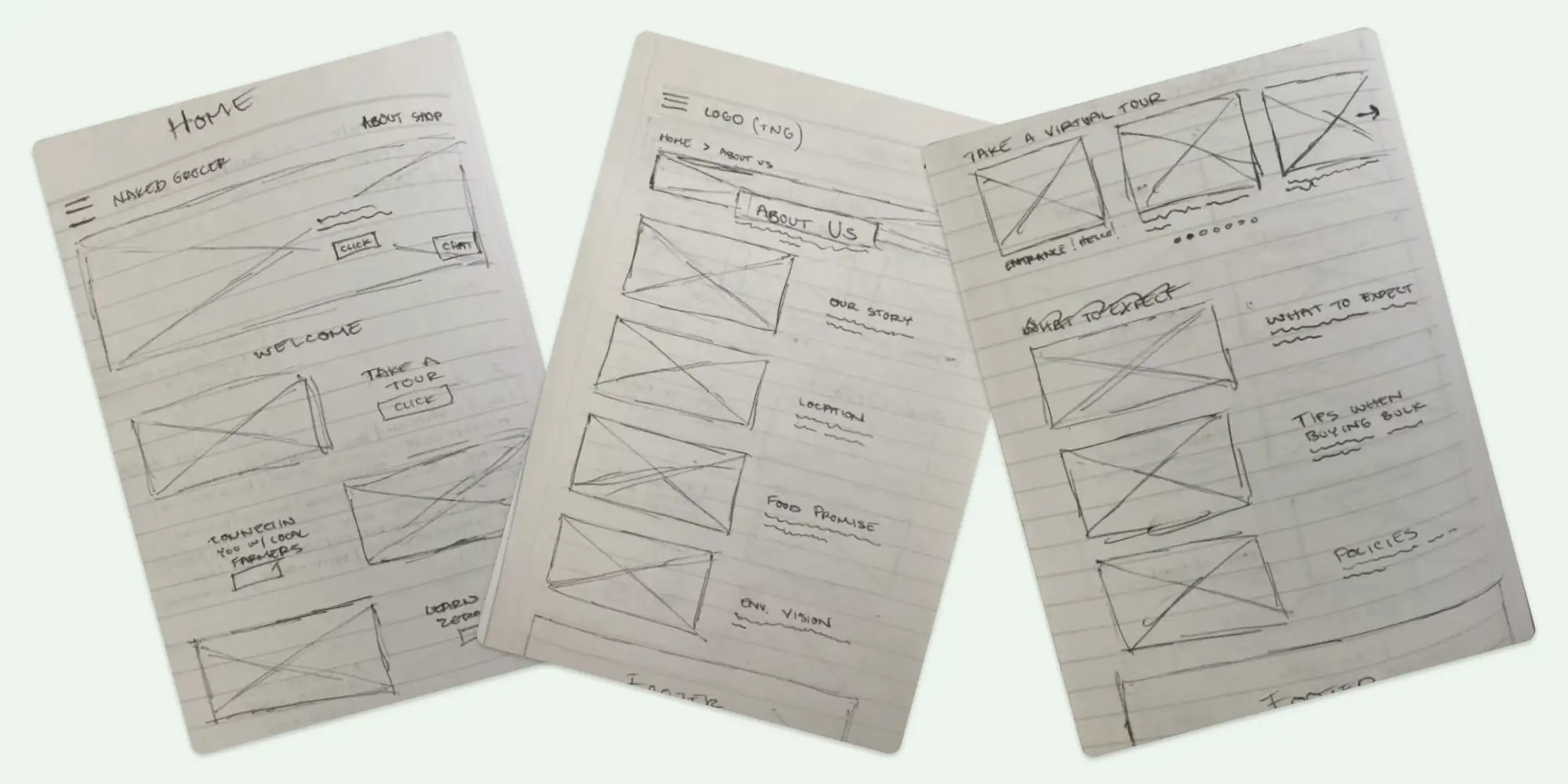
Sketching acted as an important "first step" during the design process, establishing general layout and guiding concepts such as the need for larger images to tell the website's story better.
SKETCHES
--------------------------------------------------
Sketching acted as an important "first step" during the design process, establishing general layout and guiding concepts such as the need for larger images to tell the website's story better.
LOGO CREATION
--------------------------------------------------
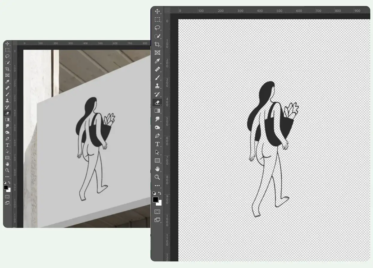
The Naked Grocer didn't have a logo, but had a cool sign. I took a picture, knocked out the background, and voilà, instant logo!
LOGO CREATION
--------------------------------------------------
The Naked Grocer didn't have a logo, but had a cool sign. I took a picture, knocked out the background, and voilà, instant logo!
LOGO CREATION
--------------------------------------------------
The Naked Grocer didn't have a logo, but had a cool sign. I took a picture, knocked out the background, and voilà, instant logo!
PRODUCT PAGE
--------------------------------------------------
The preference for online shopping stuck with me throughout the design process. Knowing the store owner lacked resources to include an online store but wanted one at a later date, I strategized this eventuality in a few ways:
- Create a "Products" page to display products available in-store (price, quantities, etc)
- Once the owner has the resources to include an online store, converting the "Products" page would be easy, relatively speaking (add a cart and checkout process)
- The chat feature, part of the current design, would help give employees the time they need to fulfill orders, and give customers the answers they seek regarding any questions or concerns they have
PRODUCT PAGE
--------------------------------------------------
The preference for online shopping stuck with me throughout the design process. Knowing the store owner lacked resources to include an online store but wanted one at a later date, I strategized this eventuality in a few ways:
- Start by designing a "Products" page
- Use the page to display products available in-store (price, quantities, etc)
- Once the owner has the resources to include an online store, converting the "Products" page would be easy, relatively speaking (add a cart and checkout process)
- The chat feature, part of the current design, would help give employees the time they need to fulfill orders, and give customers the answers they seek regarding any questions or concerns they have
LOW-FI PROTOTYPE
--------------------------------------------------
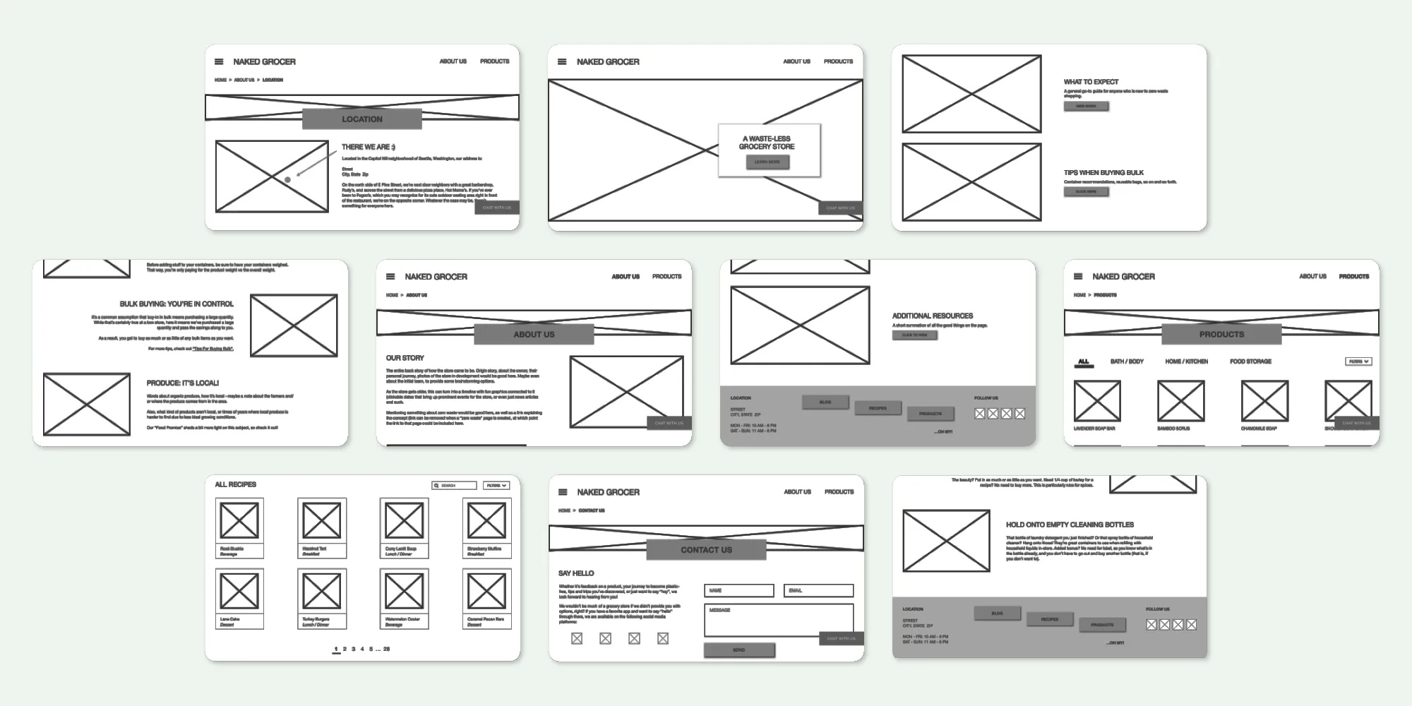
Wanting to support the early exploration and refinement of design ideas while minimizing time and resource investment, the preliminary sketches were converted into a rough low-fidelity prototype for users to test.
LOW-FI PROTOTYPE
--------------------------------------------------
Wanting to support the early exploration and refinement of design ideas while minimizing time and resource investment, the preliminary sketches were converted into a rough low-fidelity prototype for users to test.
Low-fidelity wireframes from the prototype
Low-fidelity wireframes from the prototype
Low-fidelity wireframes from the prototype
UI KIT
--------------------------------------------------
The initial color scheme, set in place by the owner, was used for the first round of high fidelity wireframes to maintain visual coherence and streamline the design workflow.
UI KIT
--------------------------------------------------
The initial color scheme, set in place by the owner, was used for the first round of high fidelity wireframes to maintain visual coherence and streamline the design workflow.
PROTOTYPE
PROTOTYPE
PROTOTYPE
PROTOTYPE
HIGH FIDELITY
--------------------------------------------------
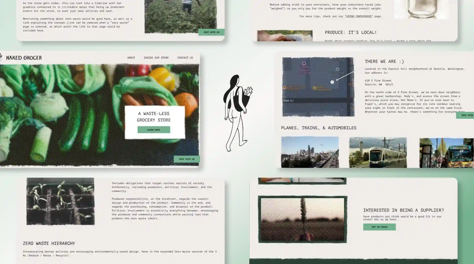
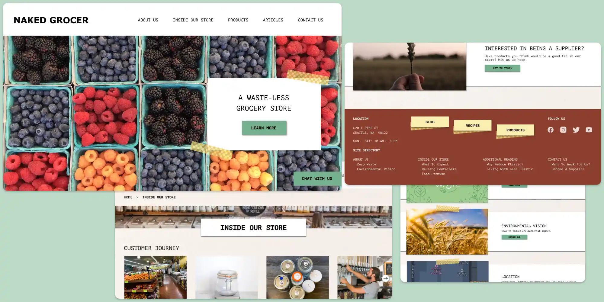
High-fidelity wireframes enhanced the design process by visualizing the user interface, allowing me to assess the visual hierarchy and layout, and further evaluate user flow and interaction.
HIGH FIDELITY
-----------------------------------------------
Wireframes from the high-fidelity desktop prototype before user testing and iterations
Wireframes from the high-fidelity desktop prototype before user testing and iterations
TEST & ITERATE
TEST & ITERATE
TEST & ITERATE
TEST & ITERATE
TESTING THE PROTOTYPE
--------------------------------------------------
Prototype testing enhanced the design process by providing real-world insights and feedback from users. Key usability issues were identified, allowing for a more user-centric and effective design.
TESTING THE PROTOTYPE
--------------------------------------------------
Prototype testing enhanced the design process by providing real-world insights and feedback from users. Key usability issues were identified, allowing for a more user-centric and effective design.
PAGE RESTRUCTURING
--------------------------------------------------
Issues tied to page location came up a few times during user testing. I conducted an open card sort through Optimal Workshop. While this led to a fairly major page restructuring, it resulted in a better overall user flow.
PAGE RESTRUCTURING
--------------------------------------------------
Issues tied to page location came up a few times during user testing. I conducted an open card sort through Optimal Workshop. While this led to a fairly major page restructuring, it resulted in a better overall user flow.
NEW COLORS
--------------------------------------------------
Knowing one of the main concerns with the site was its "granola-like" look, I pared down the color scheme to create a more uniform and appealing look.
NEW COLORS
--------------------------------------------------
Knowing one of the main concerns with the site was its "granola-like" look, I pared down the color scheme to create a more uniform and appealing look.
ITERATIONS
--------------------------------------------------
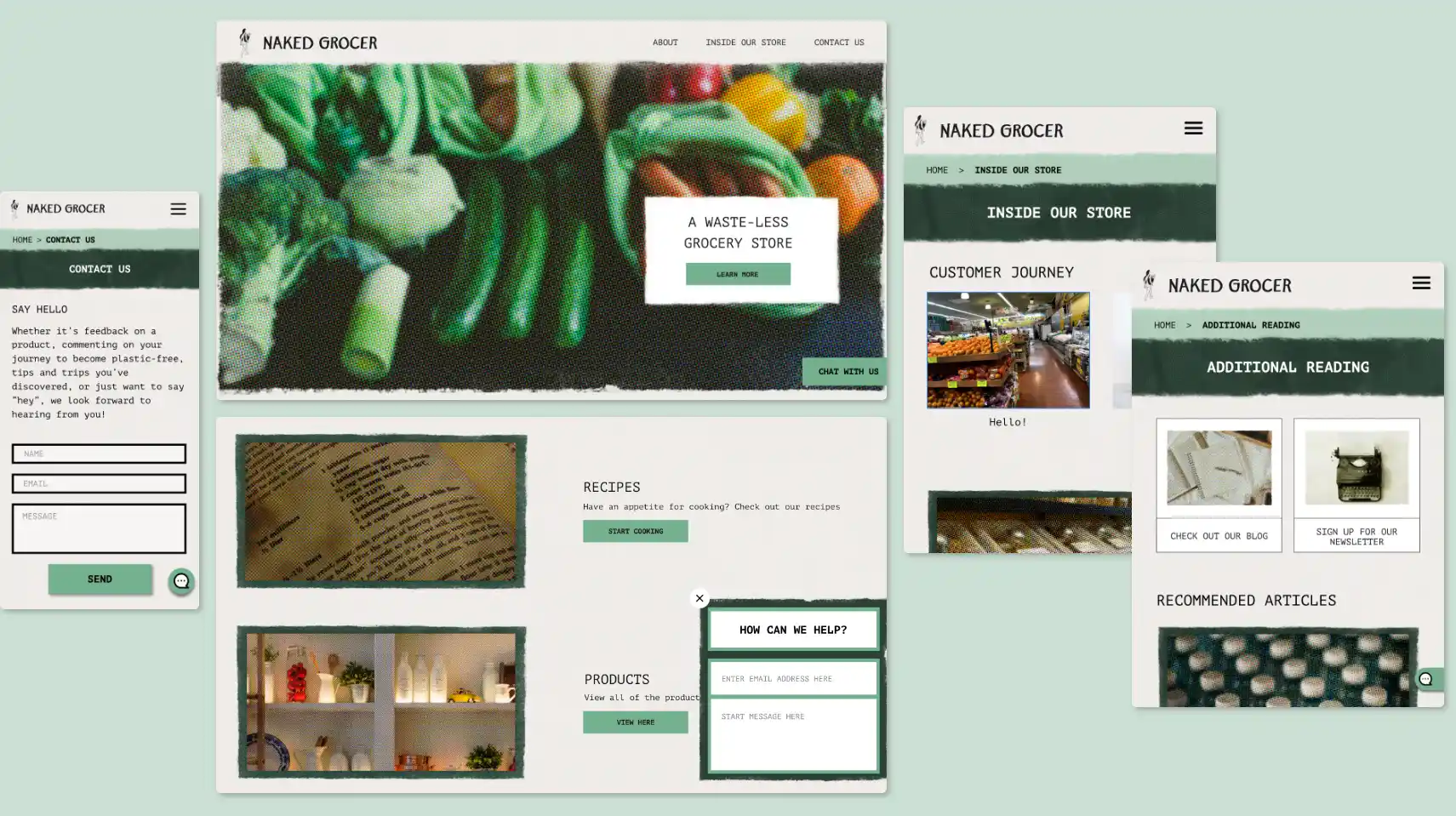
The iterative design, incorporating both user and developer feedback, resulted in a universally appealing aesthetic that is easier to develop.
ITERATIONS
--------------------------------------------------
The iterative design, incorporating both user and developer feedback, resulted in the following:
- A universally appealing aesthetic that is easier to develop
- Pared down color choices to improve brand consistency
- Restructured pages to boost the intuitive experience
ITERATED PROTOTYPE
--------------------------------------------------
ITERATED PROTOTYPE
--------------------------------------------------
REFLECTION
REFLECTION
REFLECTION
REFLECTION
WHAT I'VE LEARNED
--------------------------------------------------
The scope of the initial low-fidelity prototype testing focused mainly on user flow and design. It wasn't until later in the process, when concerns about site navigation arose, that the design experienced an overhaul. Better late than never, but I could have saved a lot of time had the initial test questions been expanded to include site navigation.
LOOKING BACK
--------------------------------------------------
Users wanted an online shopping experience. Stakeholders didn't have the money to support it. To appease both sides, I made a "Products" page to build interest in the idea of an online store, while allowing the stakeholder to convert it into an online store when ready.
If I were to do it all again, I would have designed a full online store, added the checkout process, and tested those features in the prototype. Just because it's designed doesn't mean it has to be developed, and the more information in-hand the clearer the visual.
RESULTS
--------------------------------------------------
There's something really satisfying about helping out a new, local business. The statistics are encouraging, seeing as the site saw in its first month a:
- Boost of 300 site visitors
- 10% conversion rate
The site also experienced a 25% reduction in user-reported errors.
All in all, I say this is another site officially...

UPDATE
--------------------------------------------------
As of December 2023, Naked Grocer closed its doors for good. A loss for the Capitol Hill neighborhood of Seattle. It was an honor to work with them.
UPDATE
--------------------------------------------------
As of December 2023, Naked Grocer closed its doors for good. A loss for the Capitol Hill neighborhood of Seattle. It was an honor to work with them.

