BAI TONG THAI STREET CAFÉ
BAI TONG THAI STREET CAFÉ
BAI TONG THAI STREET CAFÉ
BAI TONG THAI STREET CAFÉ
BAI TONG THAI STREET CAFÉ
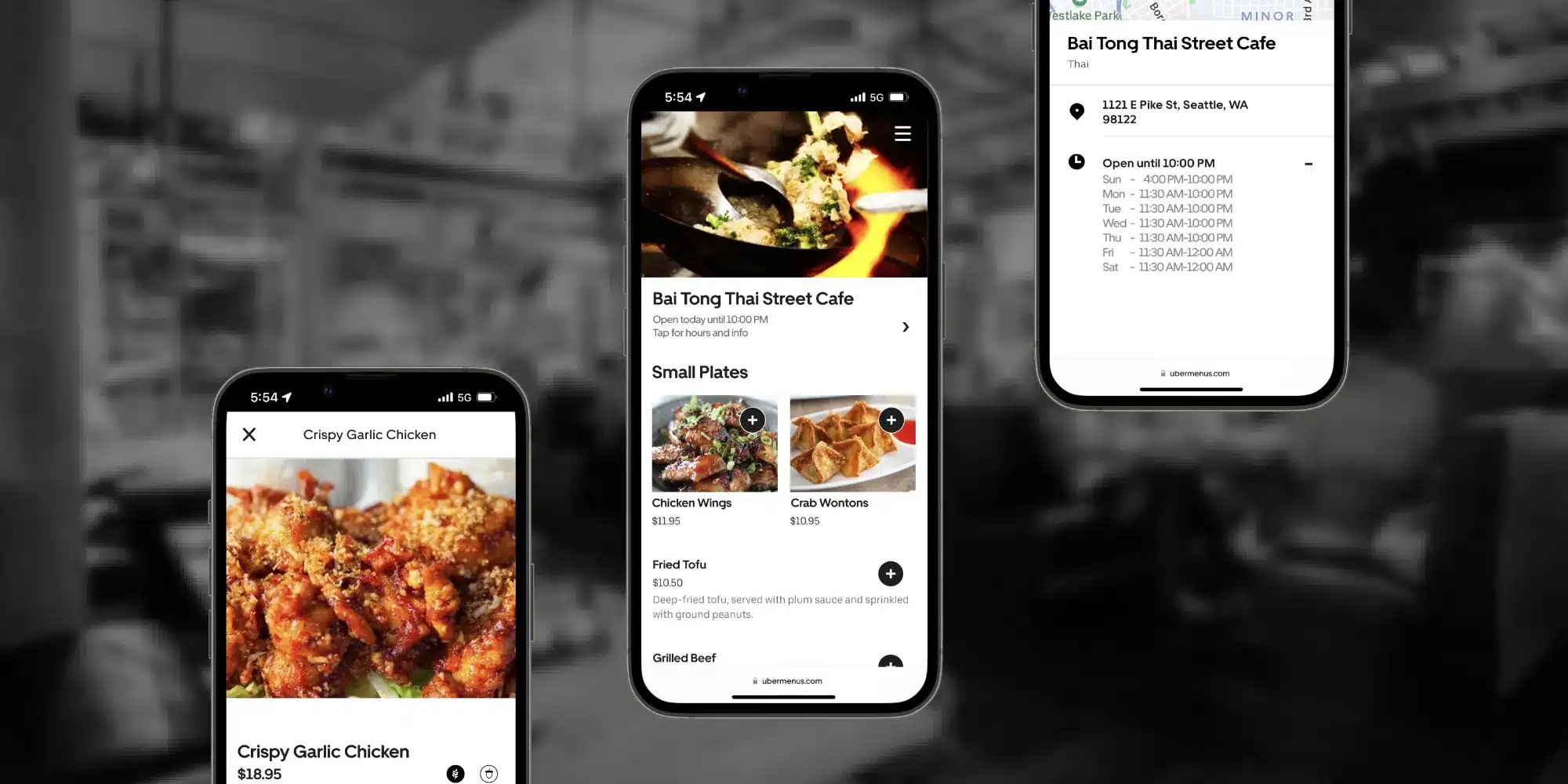
Design a mobile-friendly, in-house menu to speed up the ordering process, building on the familiar user experience of the UberEats app.
Design a mobile-friendly, in-house menu to speed up the ordering process, building on the familiar user experience of the UberEats app.
Design a mobile-friendly, in-house menu to speed up the ordering process, building on the familiar user experience of the UberEats app.
Design a mobile-friendly, in-house menu to speed up the ordering process, building on the familiar user experience of the UberEats app.
Design a mobile-friendly, in-house menu to speed up the ordering process, building on the familiar user experience of the UberEats app.
Role: Research & UX/UI
Team: Lead Product Designer
Role: Research & UX/UI
Team: Lead Product Designer
Role: Research & UX/UI
Team: Lead Product Designer
Role: Research & UX/UI
Team: Lead Product Designer
Timeline: 80 Hours
Tools: Figma • XD • Photoshop • Illustrator • Premiere Pro
Timeline: 80 Hours
Tools: Figma • XD • Photoshop • Illustrator • Premiere Pro
OVERVIEW
OVERVIEW
OVERVIEW
OVERVIEW
Problem
--------------------------------------------------
Bai Tong, like many restaurants, recently shifted to a digital in-house menu to align with new demand for contactless ordering. The digital menu is difficult to read and takes longer to read, which extends the ordering process, decreasing the number of possible diners in a night.
Solution
--------------------------------------------------
Wanting an easier ordering experience that worked with the phone instead of against it, I designed an in-house menu that builds on the familiar experience of UberEats.
Solution
--------------------------------------------------
Wanting an easier ordering experience that worked with the phone instead of against it, I designed an in-house menu that builds on the familiar experience of UberEats.
Impact
--------------------------------------------------
100% increase
Impact
--------------------------------------------------
50% increase
in overall menu interaction satisfaction, 10% decrease in order placement time, and, by implementing measures to promote transparency, a 30% boost in supplementary menu content interaction.
in ordering confidence and a 9% decrease in average server interaction time
THE APPROACH
THE APPROACH
THE APPROACH
NOTE THE EXPERIENCE
--------------------------------------------------
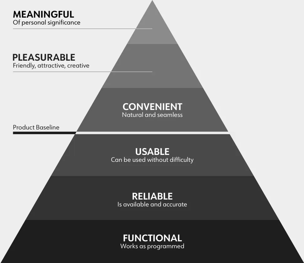
With the basic mobile needs being met by the current menu - functional, reliable and usable - I decided more time learning about dining and ordering needs would make the menu a more memorable experience.
NOTE THE EXPERIENCE
--------------------------------------------------
With the basic mobile needs being met by the current menu - functional, reliable and usable - I decided more time learning about dining and ordering needs would make the menu a more memorable experience.
NOTE THE EXPERIENCE
--------------------------------------------------
With the basic mobile needs being met by the current menu - functional, reliable and usable - I decided more time learning about dining and ordering needs would make the menu a more memorable experience.
Stephen Anderson's UX Hierarchy of Needs played a large role in product development.
Stephen Anderson's UX Hierarchy of Needs played a large role in product development.
FOLLOW THE WATERFALL
--------------------------------------------------
To have a clear understanding of where I was in each phase before moving on, particularly in the research phase, I chose the waterfall method. This helped create a more predictable and specified product and minimized scope creep.
RESEARCH & STRATEGY
RESEARCH & STRATEGY
RESEARCH & STRATEGY
RESEARCH & STRATEGY
INITIAL APPROACH
--------------------------------------------------
I started by finding and comparing a variety of digital menus, as I knew little about them beyond the handful I'd personally used.
INITIAL APPROACH
--------------------------------------------------
I started by finding and comparing a variety of digital menus, as I knew little about them beyond the handful I'd personally used.
INITIAL APPROACH
--------------------------------------------------
I started by finding and comparing a variety of digital menus, as I knew little about them beyond the handful I'd personally used.
WHAT THE MENUS DID NOT
• PDFs were sluggish
• No visuals
• Difficult to read
WHAT DID NOT
• PDFs were sluggish
• No visuals
• Difficult to read
HOW IT LOOKS TO YOU
--------------------------------------------------
I went to the hungry masses, interviewing five diners about their digital dining experiences and getting feedback on three digital menus (pdf, an unofficial delivery app and the UberEats app).
HOW IT LOOKS TO YOU
--------------------------------------------------
I went to the hungry masses, interviewing five diners about their digital dining experiences and getting feedback on three digital menus (pdf, an unofficial delivery app and the UberEats app).
HOW IT LOOKS TO YOU
--------------------------------------------------
I went to the hungry masses, interviewing five diners about their digital dining experiences and getting feedback on three digital menus (pdf, an unofficial delivery app and the UberEats app).
A PERSONA IS BORN
--------------------------------------------------
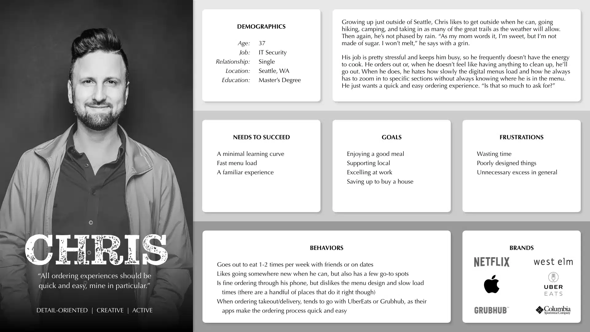
After combining competitive research and user interviews, similarities came forward for both ordering needs and interaction preferences. From there, "Chris" was created, whose habits, goals and frustrations acted as the basis for all future processes and designs.
I used the persona, Chris, constantly throughout the project to guide design decisions, priorities and create empathy with stakeholders
I used the persona, Chris, constantly throughout the project to guide design decisions, priorities and create empathy with stakeholders
EMPATHIZE WITH DINERS
--------------------------------------------------
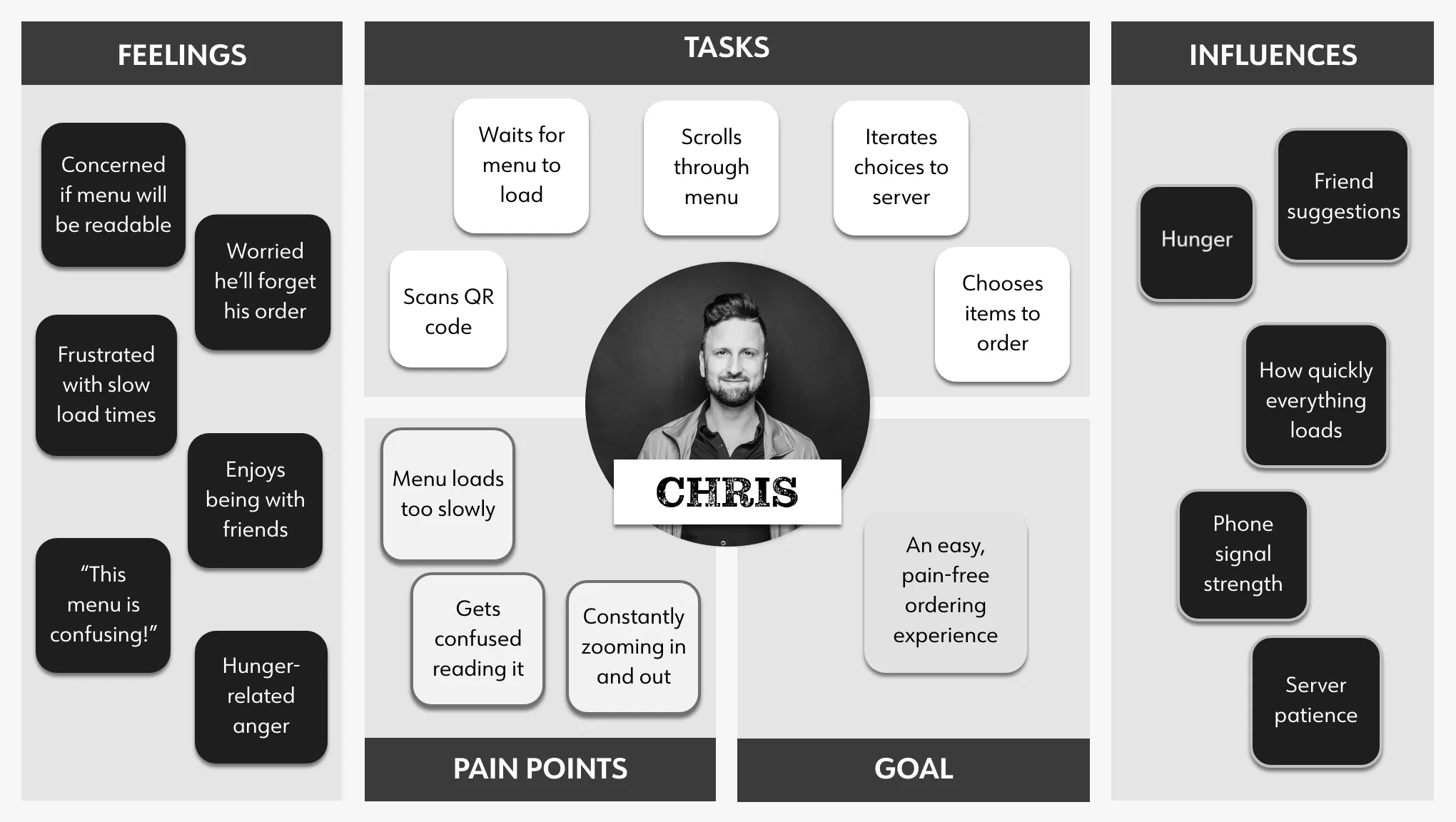
I used an empathy map to visualize and communicate the user's end-to-end experience, allowing me to understand user pain points and areas to emphasize. This helped set expectations during the design phase as well.
EMPATHIZE WITH DINERS
--------------------------------------------------
I used an empathy map to visualize and communicate the user's end-to-end experience, allowing me to understand user pain points and areas to emphasize. This helped set expectations during the design phase as well.
The empathy map helped further distill the user's experience
The empathy map helped further distill the user's experience
THE VISION
THE VISION
THE VISION
MENU FEELS LIKE AN APP
--------------------------------------------------
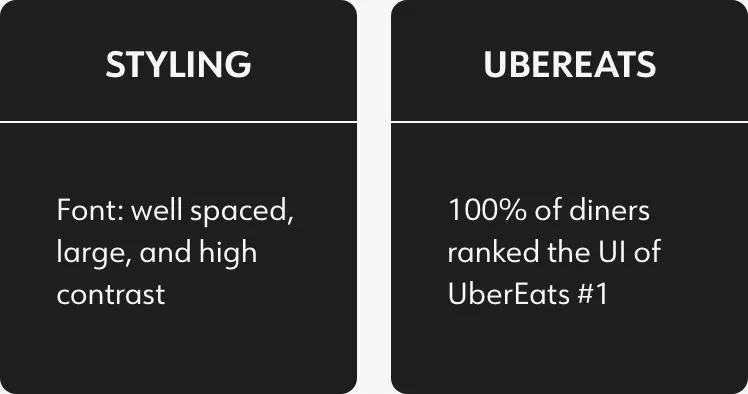
User interviews revealed a unanimous, positive association and comfort with the UberEats app. Wanting an easy set-up for restaurants and an intuitive user experience, I realized UberEats was the answer. However, I didn't want to require an app download just to view the menu. So, one of the major questions that drove my design was:
How do I make an UberEats experience that operates outside of the app?
DOES IT FEEL LIKE UBER?
--------------------------------------------------
Given the new focus on UberEats, I created a primary task flow of the app to understand how it's used. This functioned as a baseline for the other flows created, ensuring the design looked and felt like an Uber product.
DOES IT FEEL LIKE UBER?
--------------------------------------------------
Given the new focus on UberEats, I created a primary task flow of the app to understand how it's used. This functioned as a baseline for the other flows created, ensuring the design looked and felt like an Uber product.
DOES IT FEEL LIKE UBER?
--------------------------------------------------
Given the new focus on UberEats, I created a primary task flow of the app to understand how it's used. This functioned as a baseline for the other flows created, ensuring the design looked and felt like an Uber product.
CREATING THE FRAMEWORK
CREATING THE FRAMEWORK
CREATING THE FRAMEWORK
CREATING THE FRAMEWORK
CREATING THE FRAMEWORK
REPLICATE WHAT'S THERE
--------------------------------------------------
To create a recognizable app experience, the initial wireframes were low-fi replications of the UberEats app. These would later be used as a sort of "drag and drop" template, to which I added the app icons, images and color system.
The greyscale low fidelity wireframes, seen to the right of their respective UberEats screens, acted as a preliminary template which guided the design
The greyscale low fidelity wireframes, seen to the right of their respective UberEats screens, acted as a preliminary template which guided the design
The greyscale low fidelity wireframes, seen to the right of their respective UberEats screens, acted as a preliminary template which guided the design
ADDING COLORS
--------------------------------------------------
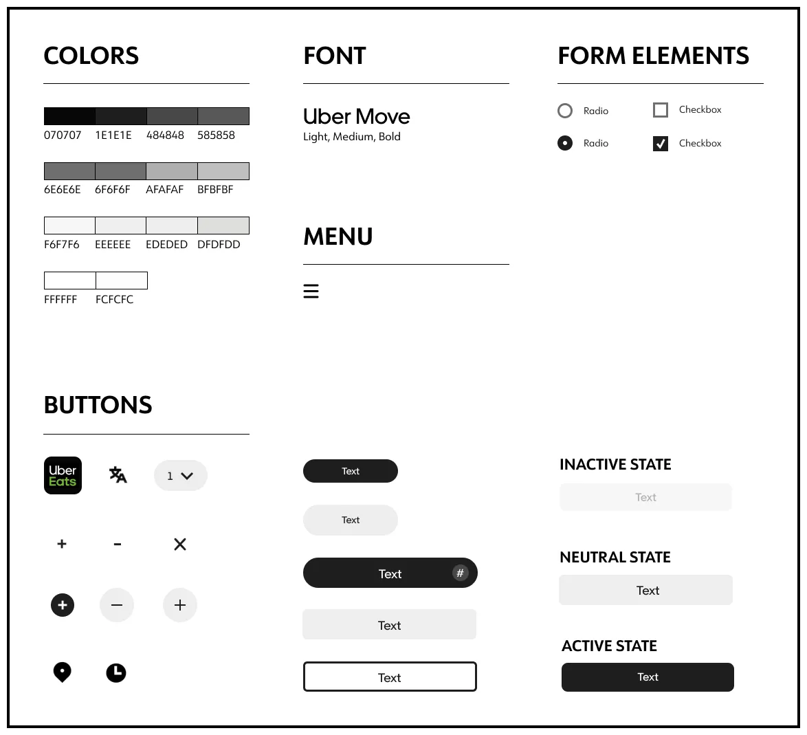
Identifying the colors and elements specific to UberEats allowed for an on-brand ordering experience, revealing valuable insights during user testing that shaped the overall tone of the product.
ADDING COLORS
--------------------------------------------------
Identifying the colors and elements specific to UberEats allowed for an on-brand ordering experience, revealing valuable insights during user testing that shaped the overall tone of the product.
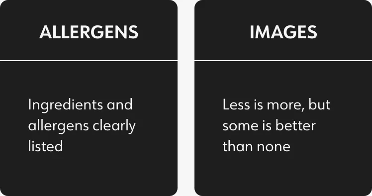
Part of the style guide used to create an authentic, UberEats-like experience. Allergen icons were not part of the UberEats design, so I created my own.
Allergen icons were not part of the UberEats design, so I created my own.
DETAILED DESIGN
DETAILED DESIGN
DETAILED DESIGN
INITIAL PROTOTYPE
--------------------------------------------------
I translated the low-fidelity templates into high-fidelity designs and pieced them together in Figma to create a working prototype. Prototype testing was the most effective way to get valuable user feedback.
INITIAL PROTOTYPE
--------------------------------------------------
I translated the low-fidelity templates into high-fidelity designs and pieced them together in Figma to create a working prototype. Prototype testing was the most effective way to get valuable user feedback.
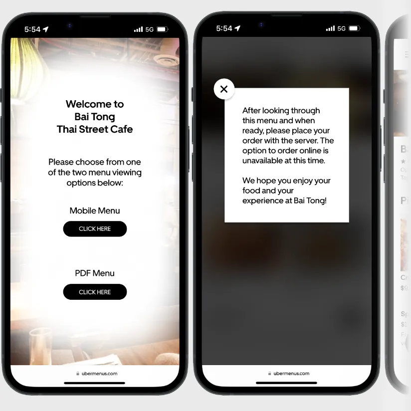
The onboarding experience gives diners a choice (mobile or pdf), gives a quick note about ordering, and then takes them to the main menu.
The onboarding experience starts with a choice of menus: mobile-friendly or the original pdf. After a quick note about ordering, users are brought to the main menu.
I prioritized matching both the look and feel of the UberEats app, ensuring a familiar experience as diners moved through the menu.
Seen below, I prioritized matching both the look and feel of the UberEats app, ensuring a familiar experience as diners moved through the menu.
As seen below, I prioritized matching both the look and feel of the UberEats app, ensuring a familiar experience as diners moved through the menu.
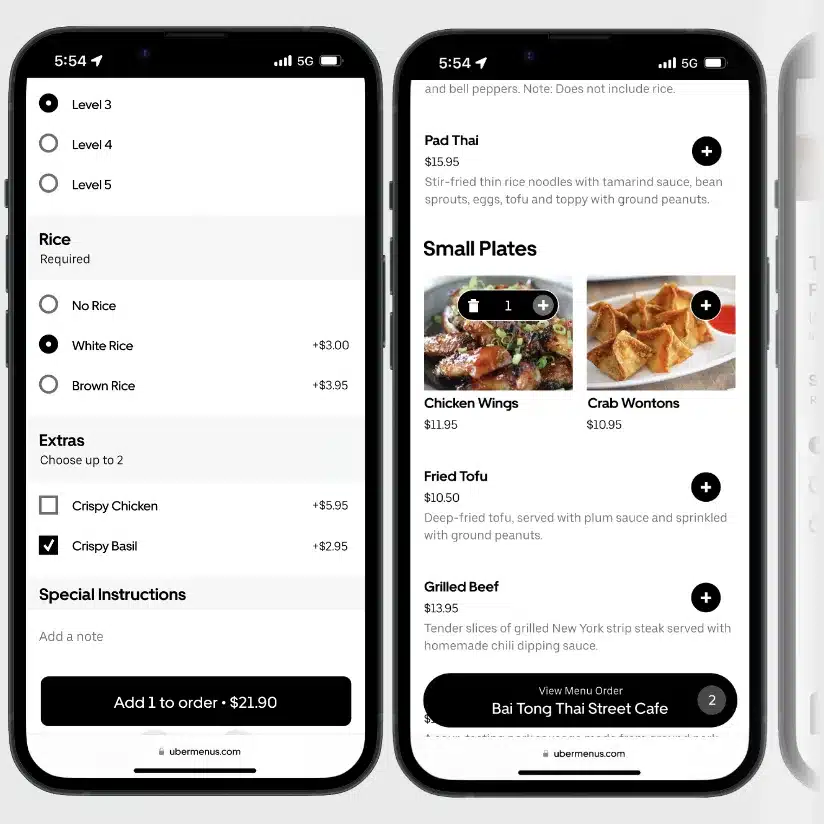
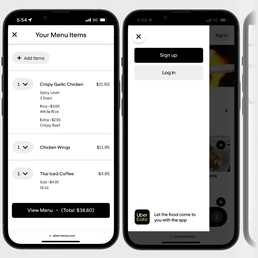
The UberEats pre-purchase page was converted into a standalone screen for reviewing one's order, while the sign-up page allows diners to open UberEats, save their order, leave a review, etc.
The UberEats pre-order confirmation page was converted into a standalone screen, to be used when placing the order with a server.
The "sign up" page allows diners to open UberEats and save their order, review the restaurant, etc.
REFINEMENTS
REFINEMENTS
REFINEMENTS
REFINEMENTS
DOES IT WORK?
--------------------------------------------------
After testing the prototype, conducted on a phone to create a more realistic experience, diners revealed key areas for adjustment.
DOES IT WORK?
--------------------------------------------------
After testing the prototype, conducted on a phone to create a more realistic experience, diners revealed key areas for adjustment.
DOES IT WORK?
--------------------------------------------------
After testing the prototype, conducted on a phone to create a more realistic experience, diners revealed key areas for adjustment.
LESS UBER, MORE MENU
--------------------------------------------------
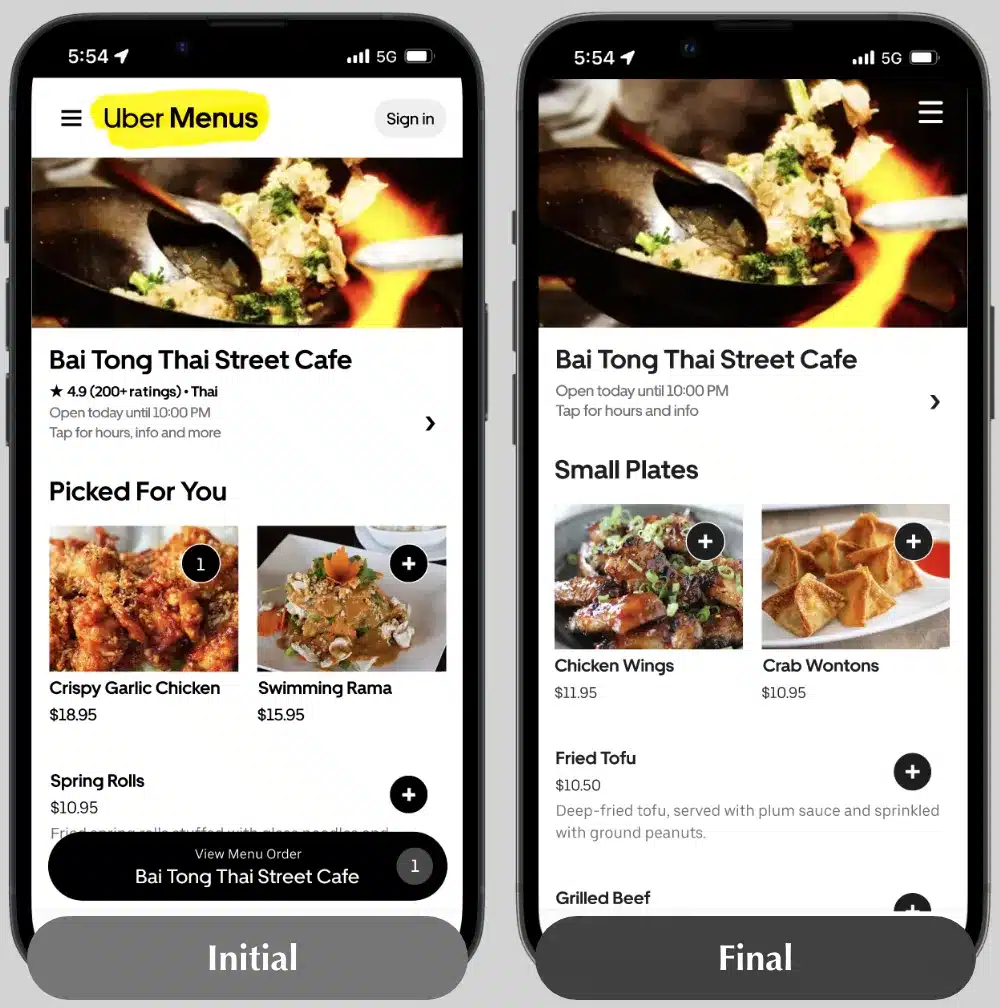
Diners felt the menu was so much like UberEats that it created confusion about whether or not they could pay for their meal online (like UberEats).
First step? Reduce the emphasis of the Uber Menus logo. Then, I analyzed word choice, discovering that UberEats uses different ordering language (eg. referring to side orders as "extras"). Shifting the word choice to reflect a traditional menu helped diners relate more to the in-house experience.
Minimizing "Uber Menus" branding and using traditional menu terminology helped diners relate to the ordering experience.
Minimizing "Uber Menus" branding and using traditional menu terminology helped diners relate to the ordering experience.
QUICK ADD
--------------------------------------------------
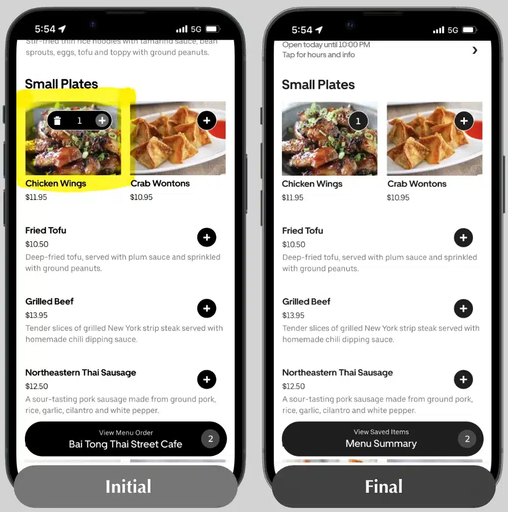
The "quick add" feature (as seen in UberEats) skips over full descriptions for less complicated items. Diners understood the intended benefit, but wanted a more complete description of all the dishes.
The feature was only available on select dishes, so changing the "Quick Add" dishes to be like the others was easily remedied.
Removing the "Quick Add" feature helped create greater consistency throughout the menu, a feature UberEats has since removed as well
Removing the "Quick Add" feature helped create greater consistency throughout the menu, a feature UberEats has since removed as well
Removing the "Quick Add" feature helped create greater consistency throughout the menu.
Note: UberEats has since removed this feature from their app.
SIGN UP
--------------------------------------------------
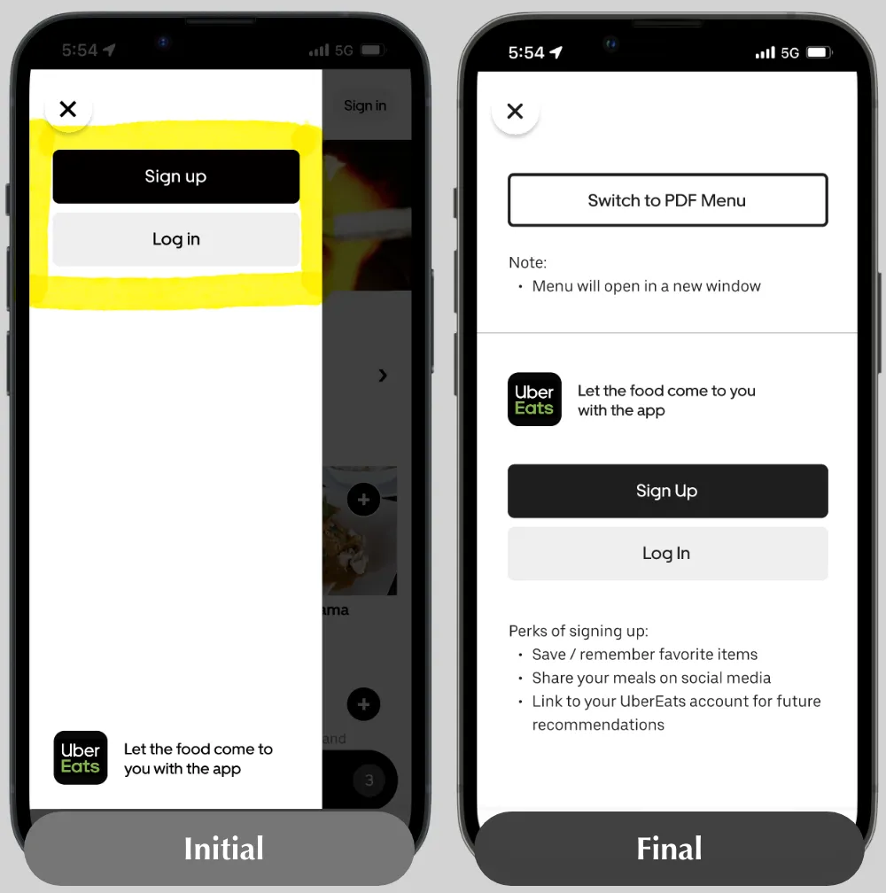
Diners were confused why an in-house menu gave multiple options to sign-up for the app, or as one participant worded it: "why do I need an app to use a menu?"
I reduced the emphasis on the app in two ways:
- Added a "switch to pdf menu" option to the overlay and included benefits of signing up
- Removed the sign-in button from the landing page
The overlay was modified to help diners (and downplay the UberEats emphasis) by offering a "switch to pdf menu" option and listing sign-up perks.
While the "sign up" overlay is a direct copy from UberEats, I modified it to help diners understand why it would improve their ordering experience.
Adding in the option to switch to the pdf menu moved emphasis away from the app as well.
THE RESULT
THE RESULT
THE RESULT
THE RESULT
ITERATED PROTOTYPE
--------------------------------------------------
ITERATED PROTOTYPE
--------------------------------------------------
ITERATED PROTOTYPE
--------------------------------------------------
ITERATED PROTOTYPE
--------------------------------------------------
FINAL THOUGHTS
FINAL THOUGHTS
FINAL THOUGHTS
FINAL THOUGHTS
FEATURES NOT INCLUDED
--------------------------------------------------
During the research and interviewing process, there were a few features I considered including in the mobile menu design:
- Send order to the server / cook
- Pay the bill through the menu
- Ping the server to stop by the table, or message them directly for specific needs (eg. napkins)
With testing, these features could be great future additions, but they were left out for two reasons:
- I felt these features went beyond the scope of the menu's MVP
- I was concerned about the increased potential for cyber attacks (a hacker, virus, etc) and the financial / logistical strain this would put on the restaurant
LESSONS LEARNED
--------------------------------------------------
Having used the clunky pdf menu at Bai Tong, I thought I had a sense of what the final outcome would be. A laughable idea seeing as the design changed course three times!
Every shift in design focus further distilled the idea that what matters is the if and the how a product is used. While the end result stayed true to that, I believe this menu, much like any product, is in a constant state of evolution.
RESULTS
--------------------------------------------------
The 100% increase in menu interaction satisfaction showed that the design aligned with user needs and wants, which was rewarding. Beyond that, the 10% reduction in order time was a surprising bonus, as was the 30% boost in supplementary menu content interaction. It bodes well for the fate of the in-house menu and the restaurant's adoption of it.
All in all, I say this is another site officially...
